23 Kasım 2012 Cuma

Giving another sense

Being a well-known brand is not just giving its function very well. Besides its function, also being well-known, spearhaead, competitive, etc. goes through having good advertisements, which can reach to every type of person and different types of interests, organising attractive events in the line of your own company but also reach to other interests...

Coca-Cola, as a worldwide brand, includes all the things I have told about and even more. That's why it reaches to every part of the world, people and becomes the spearhead. I have always liked and appreciated the commercials, advertisements they make. Also as a sponsor they organise a widespread event called Rock'n Coke in Turkey which also leads them to be the spearhead, etc. by reaching to young people and having costumers from every group of age. Of course there are tons of things they do and make them the one but these came up to my mind:)

Anyway, I just wanted to show you a Coca-Cola promo film that shooted for Eyeka co-creation community contest in 2010 for Coca-Cola. They have interpreted this well known product of them, which is coke ( :) ), in to a well-recognizable object whenever it hears the sounds of the harp.
I liked it a lot and found it creative. The way they present the product is very well organised. In a pure, sutle environment which also makes the viewer to not be confused by other things ables them to focus on the product. Also the rythm and the movements are quite good. I hope you will also enjoy!


Here is the link for the promo film


6 Kasım 2012 Salı

Alteration


Didn't you had any times that you wanted to change yourself in a way that you can make yourself feel much happier or make you get rid of things for that moment? Imagine that all the solutions are in  YOU. This time, this company ables its' costumers to string along with the situation they are at that moment. What I mean will be much understandable after you see the images that I have chosen in order to get the though of this. I have chosen these 3 images that formed my idea.


When I saw these images, I thought of people recovering themselves in a way that they can escape from things or get behind the reality, etc. Let me try to explain it with the images;


In this image it is obvious that the smile that people have on their faces are totally fake. Because the company ables people to cover themselves the way they want to or have to for a situation. For example, if you had an awful argue with your friend and afterwards have a meeting that you have to go and pretend like everything is normal and perfect, let the company help for you to switch yourself. You are the key and the company provides you to use yourself as a key!


Again in this one, if you're in a situation that you don't want to be seen by a specific person for that moment, you can change yourself in to vegetables just like an iguana where no one can separate you from other vegetables by being a costumer of this company. They make you able to deal with the situation you are and solve it by using yourself!


Once again, the person solves his/her problem by transforming themselves. For example here I thought of a person that needs moral and backing in order to feel much better and relaxed. But if he/she is lonely, the only solution could be to again transforming yourself and make yourself feel better by having another hand squeezing your hand in order to show the support.


So the main target is, they make you able to deal with the situation you are and solve it by using or transforming yourself!


28 Ekim 2012 Pazar

A Company Through Homework

  My father, who I know as a person that has lots of stuffs that he keeps through his childhood and some part of his life with the thought of keeping memories, gave me the inspiration for this holiday homework when I had chosen some images that I liked and can use for the homework. Why this gave me the inspiration? Well, besides my fathers attitude there are lots of people who keeps unnecessary objects which are out of use with the thought of to be used one day or just can't get rid of them because  they don't think that when they will be thrown, nothing priceless or beneficial will happen that it will worth for throwing. These type of people came to my mind when I found these images while I was searching for different images that I can use through my homework process.


So, my company is the one that these kind of people are searching for. We take the stuffs, objects that you cannot get rid of because of your separate several reasons of your own, that I mentioned, and erase all of them from your mind. Because we use them wherever they can fit perfectly and find their own nature(!) than before, just like the comb with the fish and the plastic duck toys found their own place. Or use them as objects that are definitely useful(!) for different things, like how teeth create a great combination with the shoe, fills its underneath and the curler for the squirrel in order to make its tail curl. 
We want you to not think about the rest after giving your stuff to us in order to make them useful or suitable than they were on the shelf they were sitting with dust on them. We use them in a way that we look from a different opinion, where nobody sees the way we do.


Here is the LOGO process! Company's aim is quite similar to recycling, but making them work in a different way. So when I was thinking about the logo, I thought about the symbol of recycling. Afterwards, the sentence -looking from different point of view- and -seeing things differently from others- made me think of our organ, eye. So, I combined them and made my logo for the company. Like recycling the stuff from a point of view that nobody else can imagine, think and see.


17 Ekim 2012 Çarşamba

Transforming to fun


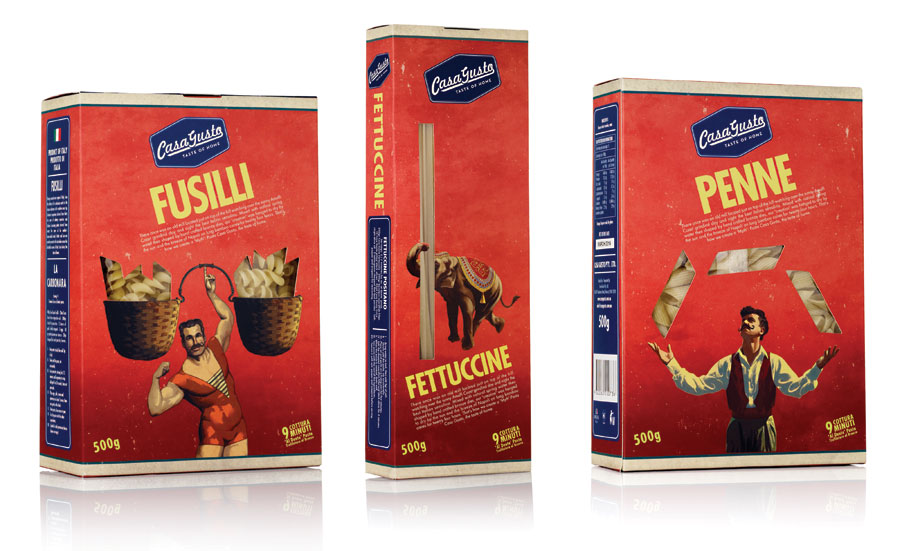
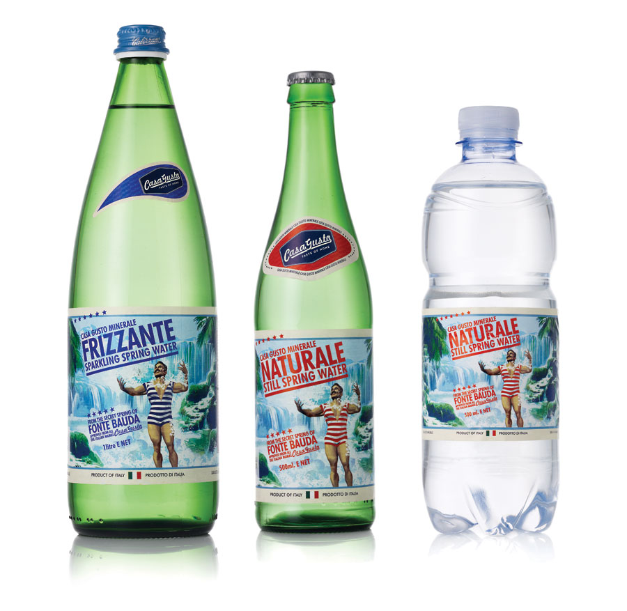
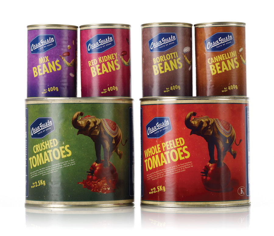
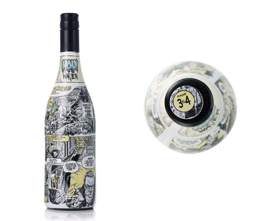
   There are millions of packages and bottles that we see through our day; but most of it are the ones that we don't care about the designs that are designed on them. They do not get the attention of consumer at all. In that situation taste matters of course.
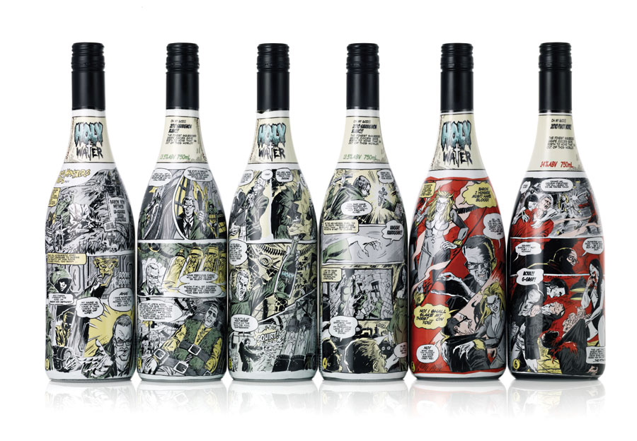
Here, the ones that I posted totally have the adventage of their design that are made on them while consumer decides what to buy. Combining cartoonish images with boring, ordinary productions that we buy from supermarkets and giving funny, enjoyable messages through those images have the chance to impress people and get their attention much more than the others. I liked to see concepts that are normally unrelated, but combined intelligently here.


How enjoyable could drinking wine be ?


9 Ekim 2012 Salı

Şirket İsimleri

This week were coming to class with our corporate names that we though to put for our company. At the end we will have 3 names to pick up and start to build up our corporate company. 
Here are my company names,

(İncik) Cıncık- Züccaciye
Sandık- 2.el dükkanı
Laklak- Cafe
Şekerli- Cafe
Fermuar- Giyim
Lakırtı- Cafe
Kurdele- Hediyelik eşya
5çizgi- Müzik 
Kulp- Cafe
Başucu- Kitabevi
Cilt- Kitabevi
Lagaluga- Cafe/Restorant
Yumak- Petshop

Karşımıza hep çıkan ama aslında çok bilmediğimiz

By the time we were informed about what will we be doing during this semester, I wanted to post a branding process to my blog this week. Why branding, because this semester we are going to create a new corporate identity with its' logo design, packaging, envelope design, business card design, etc. from all over.

This branding process that I've posted obviously shows that every logo or everything that reminds us of that corporate is not made by chance. What I mean is that, in every step there are hundreds of details, scheduling and systematic plans beneath them. 

              The National Museum in Warsaw is a national institution and a large museum which includes ancient art, Polish paintings, foreign paintings that are important collections throughout history. Here is shown its' logo and branding process.


Typface is Helvetica CE 55 Roman Regular and Bold.


And its' identity,


2 Ekim 2012 Salı

The Obliteration Room

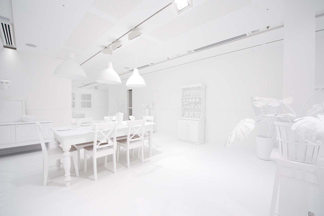
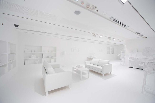
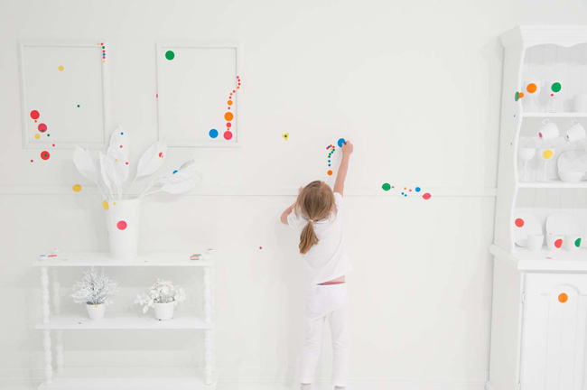
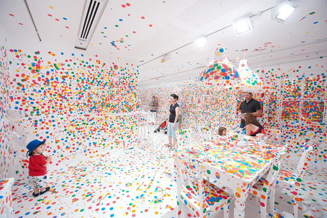
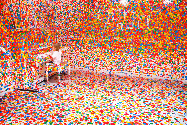
This project of Yayoi Kusama, a japanese artist who is mostly known with her obssesion with dots, which is named as The Obliteration Room is based on interactive installation which is mostly done by children. Their tools are: colorful round dot stcikers and a whole  white room with white furniture waiting to be given a spirit by them. Just a perfect match for children to represent their colorful world, isin't it?

Firstly, a white room in Quensland Gallery of Modern Art (GOMA) was fulled with furnitures which every detail of them were painted in white in order to be colored by the colorful dots.


Secondly, after 2 weeks of this preperation round colorful dot stickers were given to the participators to be stucked by them to every spot they can see in the room and on the furnitures.


And finally the great art work children have done at the end,


It is so enjoyable!


I'd like you to watch the video that is shoot by a handycam in order to make you feel the atmosphere, the excitement of children and their sensibility while completing their art work,