Tuğçe Evirgen's Blog for Va 301
8 Ocak 2013 Salı
Giderayak's calendar for 2013
These 3 images are the calendar design of my own. I picked photographs which contribute to journeys, start of holidays, etc in order to give the sense of my tourism company Giderayak and combined the two of them for each.
16 Aralık 2012 Pazar
File it!
As we have moved towards folder design, we are of course getting ideas from other folder designs from some portfolios of others. Their shapes, the way they represent the business card in it, its color, style of closing and opening it, etc. I have picked some of them that I think that they are different.
---
---
The smartness of the color and the designs fits together very good. There is no exaggeration and no unnecessary design in order to make it more beautiful and remarkable. So, the design of the folder is in this line as well. There is only one side that comes from the bottom to the inside of the folder in order to hold the papers which is white that doesn't tires your eyes and fits to the design. The business card is the point shooting in that area. Also I liked the way the two sides of the folder are closing like a window. But, it could easily open and cause to papers fall.
This folder design is quite strange. The papers inside contribute to a month which also shows the specific holidays or important days in that month with a colored sphere. So from the sphere blanks on the folder, you can see the month page and its important days just like a calendar. It is not based on to make the usage easy for the companies, but just something very different.
I just liked the surface of the folder.
Isn't it strange!
8 Aralık 2012 Cumartesi
Bite and have a flight
My third company (I posted 2 other ones before) that we are told to do by our instructor Elif Ayiter, is totally a company that I would like it to be active in our world. Because whenever we want to go abroad, the first thing which causes the biggest problem is the economic situation that we're in. The tickets are so expensive or you are expected to choose some of the countries that you want to go. Secondly, the other problem of course is TIME. We're working or studying which enables us to have vacations whenever we want and we just can't go. Thirdly, I would like to meet native people where I go, but as you have a limited program you're not able to meet other people around that you can match with your interests and hobbies and have a great time and be friends, etc. If I had an opportunity I would definitely solve these problems. With this company this is not a dream, solutions are here.
The thought of this company came through these images.
The thought of this company came through these images.
---
So, it started with the picture of breads which are with an image of Eiffel Tower in Paris. The company produces, cooks such breads that whenever you bite it with the thought of a country that you want to go, the image of the country shows up on the bread and lets the journey begin!
By the time you bite the bread, the system starts to find, match and connect people that you can understand with each other very well with your mutual interests, hobbies, etc. People that you can hang out, share things and have fun. But please don't think like this is a matchmaker. The system just ables you to have new friends abroad in your type which is WONDERFUL!
Also when you bite the bread it pauses the time and ables you to move, go, act in anyway you want to. We are complaining of not being able to go on vacations because of our jobs. BUT, our company lets you to go where ever you want with pausing the time (pausing the work time you have to do) with the bite of a bread and lets you go.
Isin't it awesome!
Afterwards, the question comes: How are we going to go, by what vehicle?
There is no vehicle! Everything is just so simple. As I told you about the problem of tickets which are so expensive that makes us think not to go, etc are all removed with this company's system. The umbrellas that you see below are your vehicle. No tickets, no money, no obstacles! You have your flight by them.
Well, I don't know what you're thinking about this company but I think it should be activated immediately!
A image of a biting mouth and a umbrella came to my mind for logo. umbrella represents the flight and the biting mouth image represents the whole start point for this journey as I have explained. Actually, it is kind of a picturized image.
4 Aralık 2012 Salı
Being aware
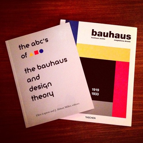
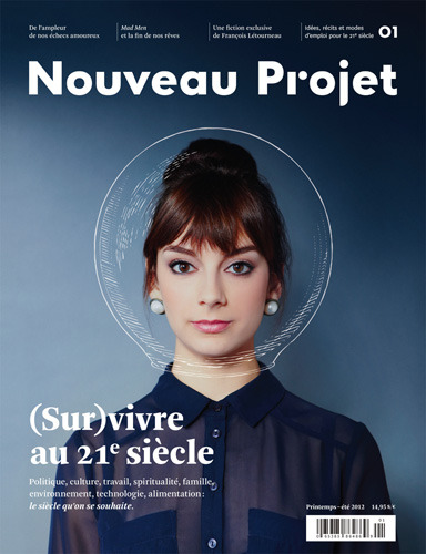
After taking typography, design, etc. classes since last year, of course I started as every VACD student to look to magazines, newsletters, posters, paper designs for companies, etc. much more carefully. It's alignment, the way the logo has been put, choice of font, size of the font, images they choose and the way they use them... So every magazine or things that have same type of designs are sort of a key for developing ourselves whether liking them or not.
So I want to post some typographic designs and magazine page designs that I liked.

So I want to post some typographic designs and magazine page designs that I liked.

24 Kasım 2012 Cumartesi
My logo
I couldn't post before the logo I have designed for the tourism agency Giderayak. So here is the process,
My idea of a parachute came up from when I thought of vacations and how people have fun by the activities they do. Sailing, bungee jumping, fishing, rafting, etc. Parasailing came to my mind and decided to use its parachute as a logo.
There were too many thin stripes under the parachute that could be unrecognisable when I made it smaller (when I put the logo in a business card). So, I tried to make the parachute as simple as I can and make a minimal representation of it; also with an artistic usage of curves for the parachute. Furthermore, I decided to take the 'i' 's dot away from its line, like the dot is doing parasailing and leaving.
And this is the last decision. As font, I decided to use Comfortaa.
23 Kasım 2012 Cuma
As we are at the step of designing envelopes and papers for our own company that we have chosen in our previous classes, we are always trying to get some ideas from other examples that other people made for different companies. I'd like to show some of them that I picked.
Wellend Health - Australian hormonal therapy clinic
Wellend Health - Australian hormonal therapy clinic
The usage of the logo doesn't disturb the viewer. It is only seen once which our instructor pointed out of that during our own designs. We see the company's name and its logo in a expected place but it is given energy with the different color of the company name and the short explanations of email, telephone and fax at the other side.
----
The placement of the logo and adress is very nice, I liked it a lot. The shape of the logo also fits good with the place the designer have chosen. It brakes the expected thought for the placement.
---
Kaydol:
Kayıtlar (Atom)


